Sustainability Product - Ebikes
Summary
California College of the Arts has been invited to a pitch day for SoCap: Social Capital Markets. The funders are looking for product concepts that address a real-world problem. My design team’s topic area is sustainable transit, and my team's responsibility is to describe the concept through engaging and emotional storytelling using a range of formats.
Team Involvement (Individual Duty)
Ted Huang (Me) - Usage Story - Interactive Tour Ty Hao - Origin Story - Comic Book Brown - Concept Story - Video
Skills and Tools Involved (Team role)
Branding | User Research & Synthesis | Design Research | Storyboarding | User Journey Mapping | Wireframing
My Role Project Length
Visual Design | Interactive experience | Two Weeks

Problem Statement
California College of the Arts has been encouraging people to use non-car based transportations more, due to the carbon emission and limited parking space. For us as interaction designers, it’s essential to understand the impact of transportation on the CCA community and discover which obstacles exist for people to use non-car based transportation. If we can we solve these problems, we can encourage more people to use non-car based transportations.
Process

User Research
My team strategized with two types of interview questions for two different targets - Drivers and non-drivers. we developed cohesive questions to ask both of the targets in order to comprehend their challenges and what do they like about their commute.

According to the interview, most people from CCA are commuting with non-car based transportation. One of the main reasons is because the students within walking distance to the school. Majority of the people have not considered the biking option as to commute. They think it's either too much work or they live way too close to school. One of main complaints from the interviewees is sometimes they would have to rush to school, and instead of walking, they would have to run, which is really unpleasant for them.
We gained insight into what the major problems are and synthesized the conclusion that our product will be somewhat less effort-requiring and easy to park or carry around.
Since we are promoting biking as the most substantial way to commute, we came up with core hypothetical characteristics of our product - we named as Ebikes:
Effortless - Our bike should be electric
Efficient - Pick up and drop off anywhere
Environment friendly - Non-car based transportation saves carbon emission
Cheap - Because of its conveniency, it’s encouraged for people to use more of our Ebikes than any other transportation.
Group Work - Working Process
(Clickable Slideshow)


Final Persona

Group Work Summery and Synthesis
Within only one week of working time, following the several revisions we have iterated on our persona and product goals, we formed our team alignment based on one focal point - Conveniency - which means easy functioning app, location flexibility and effortless biking.
After thoroughly understanding who is our persona, and who are our main audiences, with the same persona we had synthesized together, we had to individually come up with a more in-depth storyline with assigned story type about our persona using our product.
Each storyline will be a different type of user journey, but user’s goals and needs will stay coherent.
Wireframe & Story Arc (Individual Work)

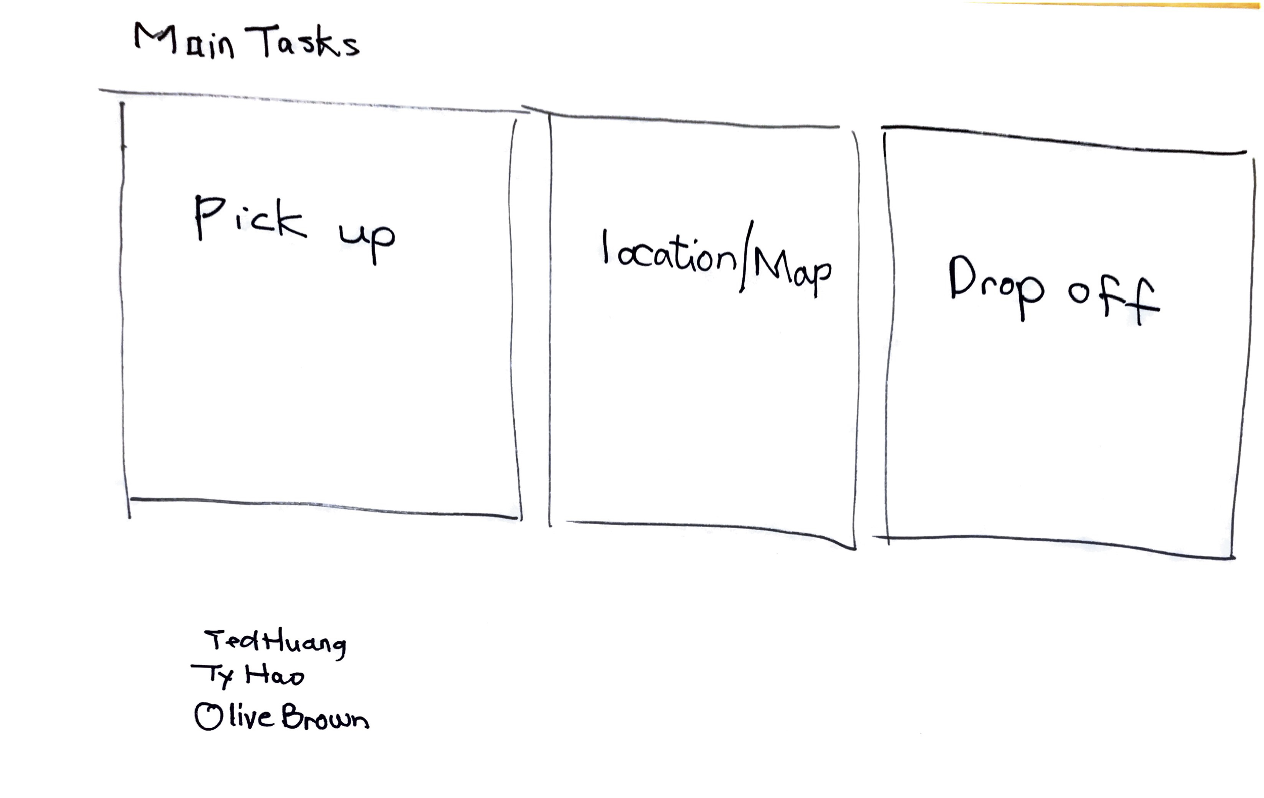
During wireframe making, I have considered making 5 main screens as one flow, because we have imagined this as a frequently used app, it’s critical for people to have an easy access and a quick responsive UI.
Usage Story Arc

Usage story arc is a way of showing an exact flow/process of how user might encounter with our product and how would they use it for one time
Final Prototype
Logo Design/Slogan

Main Screens
With main screens and logo, I chose to use my preferred minimalistic style to excel the cleanness of the cohesive design - I mainly used thin lines for some of the icon design. and left plenty of white space for the color contrast, which would also bring ease to users’ eyes.
As long as the users are signed in, it only takes 5 screens for them to complete one experience of using this app.

Interactive Tour Explainer - With Voiced Annotation
Reflection
Self Reflection
From this project, I have learned that as an interaction designer, we can create product and apps not only serve the user's needs, but also it can make our environment better and safer. It is crucial as a designer to consider these elements where we can contribute more into our humanity and environment. It is easy to come up with ideas of saving the environment and help the users to achieve their goals, but it is challenging to actually make the product work. I have learned that there are many factors we have to consider before "launch" the concept/product. The factors can be a disappointment sometimes - it could be based on its functionality or external factors like budgets. As an interaction designer, it is our job to solve the problems that are in the way, or at least transform these problems into alternative path to reach closer to our product's success.
Project Challenges
For making the interactive tour as an individual assignment, I had come across some visual design challenges - cohesiveness, intentional details and what makes the app easy to comprehend but covers all the functions at the same time.
Lessons For the Future
This project was given in a short amount of time. It is perfect an opportunity to think fast and make actions happen spontaneously. Although, I would want more user ability test to examine out our product, to see if it’s practicable. Maybe try to revisit these participants we had interviewed and to see if our product could satisfy their needs.