Out of Box Experience Design
Summary
I designed an out-of-box product and experience to advance the experience/narrative and also to facilitate a specific behavior modification.
In addition to the physical material and the on-screen prototype, we filmed a short demo video to communicate the final envisioned experience and how it facilitates desired behavior change
Skills and models
Branding | Visual Design | Design Research | UX Design | Concept Prototype | Prototyping | System Model | Wireframe | Package Design | Video
My Role Project Length
Lead Designer Four Weeks (Fall 2019)

Problem Statement
Context
To design a physical product with an app for a specific behavior change.
Challenge
College students don’t call their parents enough and some has progressively developed an unhealthy relationship with their parents.
Opportunity
How might we encourage people to call their parents more often and have a more engaging and empathetic conversation when they call their parents.
CLICK TO VIEW THE DEMO VIDEO
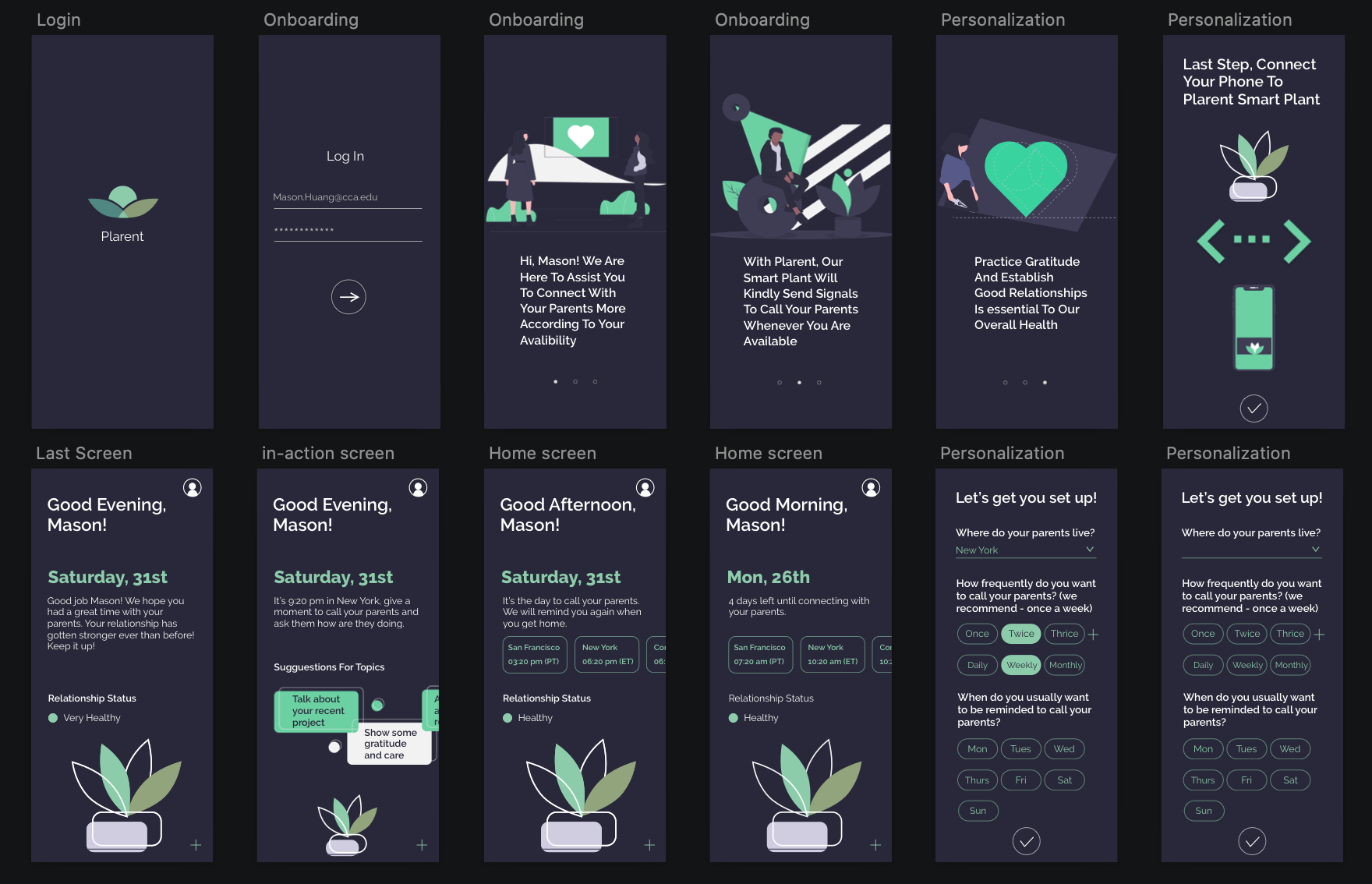
Key App Features


Design Process

User Research
Primary Research
I interviewed four participants in total to validate my core assumption of the behavior I was aiming to modify - College students don’t call their parents enough while they are away for school. I conducted three interviews with three different college students who find out their relationship with their parents and how often do they call their parents. I also interviewed one parent who has three children who are both adults now to comprehend the need on their side.

Interview Insights and Opportunities
A lot of people don’t have a good (or good enough) relationship with their parents:
How might we encourage people to connect with their parents more through phone calls.
People don’t know what to talk about when they call their parents besides asking for something they need:
How might we help people to have a more engaging and meaningful conversation when they call their parents.
People don’t have enough time or put time out for calling their parents:
How might we assist and remind people to call their parents when they are available.
Concept Development
Ideation
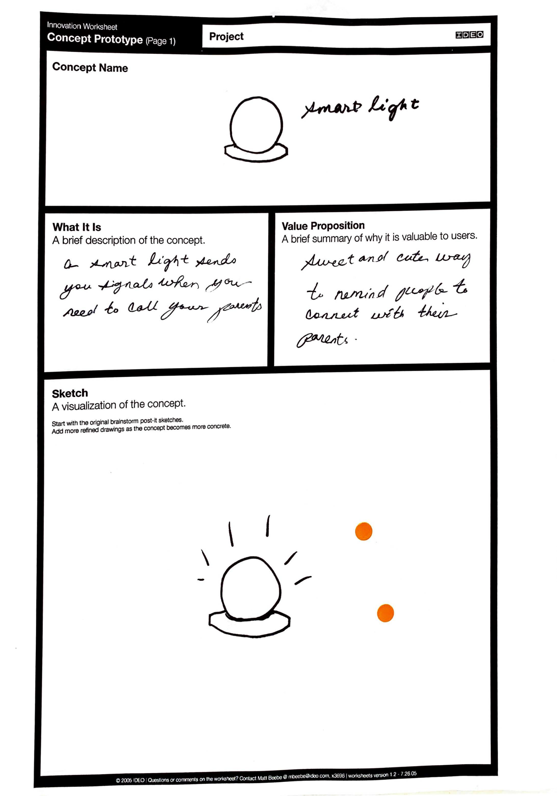
I used a short amount of time to brainstorm 30 crazy and random ideas that could possibly help me manifest the solution. I also utilized 30 concept worksheets to draw out the concepts and selected the final 5 concepts that have the most potential.
This quick timed method helped me to explore different ideas without having any biases or personal barriers.

Narrowed Down to Five Concepts


Deciding the final potential solution by using success metrics

Concept User Testing
After picking out the final concept, I started to draw out and explore some In-App features - questionnaires in the onboarding section, location users might want to set up, and topics they might interest to talk with their parents.
I tested these minimum viable features with two target users to validate my ideas and to maximize its usability.

User Testing Insights
Questionnaires could make the user experience less efficient since the potential users, presumably, are mostly going to be busy all the time.
To set up a specific location to be reminded is difficult because the physical product is cannot always be carried around.
It’s better to put the physical product in one fixed location where users can see it in their daily routine.
Developing User Persona

User Experience Map
I created a user experience map to help myself to understand user’s needs more thoroughly. By mapping out particular use cases, it allowed me to see the bigger picture of the user’s entire interactions before I start to prototype the product.

Product Design
Physical Product
The goal for this product is to be a physical reminder - I have envisioned the physical product to be relatively petite and appealing because of the LED light that is going to be implanted can make the product look distinct.


Package Design Final Product
App Design
From Logo exploration to confirm the final logo, at first, I valued the core idea of my product, which it’s the tool for reconnecting and reconciling between one another. Therefore, I picked green, which symbolizes health and positivity. I also wanted to create something that represents balance and harmony, in which the final logo has two leaves that intersect within each other. The two leaves can also be interpreted as - the parents and the child.


Before I moved forward to wireframe the screens, I designed a task flow to strategize how to tackle down the user experience in order to make flow - simple, clear, and user-friendly.

App Wireframe and Final Mockup

Printed Instruction Pamphlet
Product Demo
Before filming the demo video, (which is shown in the very top of the page) I created a storyboard to demonstrate how Plarent will be used in context which I used to guide my Demo Video filming.

Thinking Forward
Self-Reflection
This project is specifically focused on behavior change. I learned the preparation work before starting designing is very important - to thoroughly study and understand the demographics and psychographic needs of target users. By orchestrating in this direction, I was managed to figure out why this behavior is worthy of changing.
Project Challenge
I had hard time on designing the onboarding questionnaires. I wasn’t sure what specific questions to ask and I was worried about if the app set-up process would be too long and overwhelming for the users.
Lessons For the Future
It's optimal to validate the usability of my product with some well-planned concierge test - to manually control the product as users trying it out on their daily basis.